This is a Fullwidth Header h2 with Fullwidth Header Image displayed behind
This is the Fullwidth Header Subline field.
This is the Fullwidth Header Header text field. Image options available are:
- Fullwidth image = One file only, 256 MB limit, Allowed types: png gif jpg jpeg. Image here is a black placeholder 2000x900.
(Fullwidth header image is also needed as 400x400 when displayed in a promo, both sizes should be provided.) - Foreground image = Upload an optional PNG with an an alpha channel to use as a parallax foreground image. One file only, 256 MB limit, Allowed types: png. (No Foreground image shown here.)
- Small image = One file only, 256 MB limit, Allowed types: png gif jpg jpeg. (No Small image shown here.)
- Background video = One file only. We recommend 3-5 MB video file size so that it can easily play on the website, although the max allowed is 20 MB limit. Allowed types: mp4. (No background video shown here.) A fullwidth image (see first bullet above) is required as a fallback for all background videos.
A Content Box can be added optionally -- it is added in this case.
Content can be positioned Left, Right, or Center -- Defaults here is "center".
Content Box Style can be None or Inverse (reversed as black with white tex) -- None selected here.
This is an Intro Paragraph, Title
This is the Intro Paragraph Subline
This is the Intro body.
- The Intro image space is 690x460..
- Alt text is required for every image.
The Intro image position defaults to the left but can be positioned to the right with a checkbox in the CMS; no custom positioning beyond default or Right.
- The image here is positioned Right.
The Intro can be made full width as a first module if the page has a FullwidthHeader or Slider.
Above this area, but not displayed on this page, is a "Promo Settings" section whereby a Headline, Subline, Image, Summary, and Label can be added to promote this page on other pages.
Below you can see use of an option within the Intro Paragraph to include multiple "Paragraph Sections" references that link to other pages on the site. The example here is a "Text + Image" Paragraph Section.
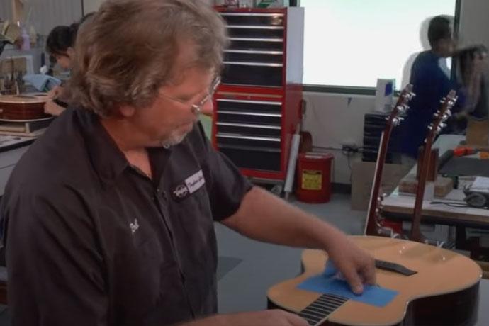
This is an "Image + Text" paragraph

This is the text field. Paragraph Sections can be added with or without an accompanying image. A referenced Image Module* can also be added instead of a lone image. Alt Text is required for all images.
In this example we have added a single plain Image:
- The image size is 400x400
- This Image + Text can optionally be wrapped in a Well, and that Well can be styled as noted earlier. (Well is not chosen here.)
- The image can be positioned on the left (default here) or on the right in a 2-column layout (as in the 2nd image, a video embed, below).
*Image Module options Figure, Figure Hotspot Group, Slide Group or Video Embed.
This is a Basic HTML paragraph
HTML content can go here.
- Checkbox option to "Wrap in SingleColumnContent" is selected in this case. (If not, this copy appears to the farthest left edge of the page with 0 margin.)
- Note: We do not hack HTML to code layouts outside the CMS default.
This is a Basic HTML paragraph with 2 column layout
This is a Left Column
Lorem ipsum dolor sit amet, consectetur adipiscing elit. Suspendisse eu erat vitae eros dignissim fringilla nec et elit. Sed placerat feugiat lorem non porttitor. Nulla luctus porttitor massa, non consectetur justo pretium a. Integer ut semper dui. Orci varius natoque penatibus et magnis dis parturient montes, nascetur ridiculus mus. In dapibus condimentum eros vel cursus. Suspendisse orci magna, dignissim id auctor quis, feugiat vel magna. Suspendisse potenti. Quisque non sapien sit amet tortor mollis aliquam. Nullam sed viverra dolor. In risus felis, viverra a risus in, viverra finibus sem. Vestibulum eu magna leo. Vivamus cursus nulla ac elit fringilla, sit amet egestas libero dictum. Pellentesque non euismod nibh. Integer id ultrices purus, vitae rhoncus leo.
This is a Right Column
Donec condimentum sem at ultrices dapibus. Nullam venenatis lectus ex, eu finibus turpis mollis at. Aenean auctor aliquam mi, vel commodo nisi feugiat sit amet. Vivamus eu feugiat eros. Suspendisse vel rhoncus ante. Cras viverra augue convallis felis accumsan, non egestas sem molestie. Ut varius id nisi ac feugiat. Nulla facilisi.
This is a Well Headline: A Well displays a background band of color
This is the Headline (edited to h3) of a Basic HTML paragraph inside the Well
The Well Style can be None (light grey background), Tech (textured dot background, similar to packagin), or Inverse (solid black with white text).
- This one is set to Style "Tech."
As with this page overall, the Well can contain within it a variety of paragraph types like an Accordion, an Intro, an HTML 2-column, etc.
This Basic HTML paragraph can be formatted as a SingleColumnContent via a checkbox within the CMS.
- Note: We do not hack HTML to code layouts outside the CMS default.
This HTML paragraph can also be formatted via checkbox option to "Wrap in Single Column Content."
- (This option was not chosen here.)
This is a Card Group, Headline (default h2)
This is the Card Group Module intro area. Promo items are added here to become Cards. Number of Promo Items seems to be unlimited; four are added here.
- Image size here is 400x400
- The number of cards in a row can be set to 1, 2, 3, 4, or 6. This one is set to 3.
- As you see, an orphan card may create a bleed!
- Card Style can be set as None, or Rounded -- this Card Group style is set to None.
- Layout can be set as None, Centered, Alternate, or Timeline -- this Layout is set to None.
- Start -- which side to start on Alternate or Timeline layouts -- can be set to None or Right. This Start is set to None.
- The Card Group can be set to be wrapped in a Well (not chosen here).
This is a Promo Group Headline (default h2)
Intro text goes here.
- The promo included here has an image of 400x400
- Multiple promos items can be added, just as with Cards.
- Columns can be set for the mutliple promo items to display small/medium/large at each breakpoint.
- Promo style can be set to "none" (default) or "overlay. This one set to Overlay.
- The Promo Group can be set to wrap inside a Well (not chosen here).
This is the Headline of an Image Grid (default is h2)
This is Image Grid Intro text.
- Multiple Promo items can be added; two shown below
- Same treatment as in the Promo Group (and same Promo item used here to compare template layout).
- Image for Promo item remains 400x400
- The Image Grid can also include links to other content, provided via CMS fields.
- Links can be added, and Link Text can be used even without a link as displayed below.
- Column breakpoints can be set if needed.
- Column style can be
- "Dark style" to change the overlay color;
- "No padding" to remove the padding between images, and
- "On" to optionally wrap the Image Grid in a Well. "On" is selected here.
- This Well can be styled like like the others (None, Tech, of Inverse); this one is set to Inverse.
-

Sample Promo, headline
Sample Promo subline
-
Sample Promo, headline
Sample Promo subline
This is a Single CTA, headline
We are not using this item on the site currently;
Image is optional and used as a background only, 400x400 for demo purpose.
This section can be styled "None" as it is here, or "inverse."
This is an Accordion containing expandable content
This is the Intro text for the Accordion.
Two or more Paragraph Sections are referenced to create the Accordion items. Used here is the previously-created sample Paragraph Section, showing that any content in a Paragraph Section can be pulled into an Accordion.
Notes: 1) The first accordion item is open by default; 2) Toggle the Accordions open and closed by clicking the headings; 3) One Accordion is always open.
Accordions can be wrapped in a Well with the usual Well style options of None, Tech, or Inverse. Well + option Inverse chosen here.
- This is the Paragraphs Section Label
-
This is an "Image + Text" paragraph
This is the text field. Paragraph Sections can be added with or without an accompanying image. A referenced Image Module* can also be added instead of a lone image. Alt Text is required for all images.
In this example we have added a single plain Image:
- The image size is 400x400
- This Image + Text can optionally be wrapped in a Well, and that Well can be styled as noted earlier. (Well is not chosen here.)
- The image can be positioned on the left (default here) or on the right in a 2-column layout (as in the 2nd image, a video embed, below).
*Image Module options Figure, Figure Hotspot Group, Slide Group or Video Embed.
This is a Tab Group
This is the Intro text for the Tab Group.
Two or more Paragraph Sections are referenced to create the Tab Group items. Used here again is the previously-created sample Paragraph Section, showing that any content in a Paragraph Section can be pulled into a Tab Group.
Tab can be made fullwidth via checkbox option: Tab controls should be shown across the whole page, not only contained in the content area. You can see tabs displayed on the live site here.
Note: tabs on this sample page are not fullwidth for comparison.
Tab style options are None, or Alt. Alt chosen here.
Tabs can be set into a Well with the usual Well style options of None, Tech, or Inverse. No Well chosen here.
This is an "Image + Text" paragraph
This is the text field. Paragraph Sections can be added with or without an accompanying image. A referenced Image Module* can also be added instead of a lone image. Alt Text is required for all images.
In this example we have added a single plain Image:
- The image size is 400x400
- This Image + Text can optionally be wrapped in a Well, and that Well can be styled as noted earlier. (Well is not chosen here.)
- The image can be positioned on the left (default here) or on the right in a 2-column layout (as in the 2nd image, a video embed, below).
*Image Module options Figure, Figure Hotspot Group, Slide Group or Video Embed.
This is an FAQ Group Headline
Here we can add one or many references to FAQ content nodes; just one FAQ node is referenced below. FAQ nodes are used on the FAQs page of the site and have also been used within campaign pages to create the individual "continue reading" stories as seen here.
(The campaign page itself is just a Paragraphs Page like this sample page. The headlines, copy, and pictures that precede the individual stories are created with an Image+Text Paragraph Section.)
-
Is this the Sample FAQ Title? Why yes, yes it is.
Any kind of content can be added to an FAQ node. Currently in use on the Support/FAQs page as well as FAQ nodes are currently being used on the Support/FAQs page and also used to create the String Tensions for Tuning content included as a tab on a product page.
Below is the Elixir Product Shelf
These are the shopping links to product pages. Only one actual product page is referenced here; you will see drop-down gauge choices and "Add to cart" functionality.
Below is the "Sound Experience" paragraph
The Sound Experience compares the latest coating technology, "OPTIWEB™." The page is not in the site navigation but is included on the home page in the hero carousel area, and is also provided as a "listen and compare" link on the OPTIWEB™ product pages. Also used in campaigns.

Please view this
experience in landscape
mode
Below is a "Scroll Video" paragraph
The Scroll Video paragraph includes:
- A Background Video -- One file only, 25 MB limit, Allowed types: mp4.
- A Small Image -- One file only, 10 MB limit, Allowed types: jpg jpeg, Images must be larger than 690x690 pixels.
This is the Shopping Cart headline
Shopping Cart intro text goes here. Can be wrapped in a Well with the usual options (None, Tech, Inverse); no Well used in this example.
The "choose a gauge" list is created by manually adding specific Product Items; just three items added here.
Choose a gauge
This is an Image Module, headline
Image Module text goes here. Only one image module can be included.
Image Module options include a Figure, Figure Hotspot Group, Slide Group or Video Embed. This Image Module can be wrapped in a Well with the usual style options of None, Tech, or Inverse -- a Well styled "Tech" was used here.
A Video Embed is used here as the Image Module. (Video embed modules often used on Tips & Tricks pages).